


GOD GIRL FIT
The Opportunity: God Girl Fit, a Christian Fitness Lifestyle brand in its incubation stage, sought to establish a cohesive visual identity to propel its growth trajectory. The brand envisions itself branching into athleisure wear, developing a fitness app, cultivating a substantial social media presence, and expanding into unforeseen avenues.
The Results: With a mission deeply rooted in empowering Christian women on their fitness journeys, God Girl Fit's visual identity now reflects its core values of strength, boldness, and consistency. The new branding exudes professionalism while embracing simplicity, ensuring versatility across various platforms and mediums.


BUCKS COUNTY SETTERS
The Opportunity: Bucks County Setters, a preservation breeder of English Setters, aims to revive the breed's popularity. They sought a logo that features Ivy, their foundation dog, and embodies the essence of the breed.
The Results: We crafted a brand that encapsulates the regality, friendliness, and hunting drive of English Setters, alongside the natural beauty of Bucks County. Through meticulous selection of colors, fonts, and imagery, we evoked the desired emotions and associations. The resulting brand is visually appealing, emotionally resonant, and effectively communicates the unique qualities of Bucks County Setters.
Check out their site and socials- also created by Firecracker!
RAT MOGUL BRAND


The Opportunity: Rat Mogul, a clothing brand that began as a college project and quickly became a campus sensation, sought to establish a distinctive style featuring a whimsical rat character. This unique approach attracted streetwear and meme fashion enthusiasts, and Rat Mogul has since evolved into a creative powerhouse for rat-themed fashion.
The Results: Rat Mogul's visual identity now perfectly embodies its playful and quirky spirit. The brand's light-hearted, fun attitude resonates with a broad audience, uniting those who share a love for rats.
ROSE & RAYE WEDDINGS
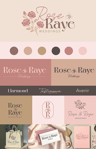
The Opportunity: Rose & Raye Weddings, a new wedding planning service, sought to establish a unique and captivating visual identity that would exude elegance and beauty while staying true to founder Kayla's vision and personality.
The Results: Within just a week of launching with the website we also designed her, Kayla received four inquiries and signed one client! Her branding feels authentic and eye catching and her website is clear and easy to navigate.

DIVINE BOOKKEEPING
The Opportunity: Divine Bookkeeping was looking for a rebrand that looked more professional but still kept the femininity and natural essence of the brand
The Results: Divine Bookkeeping's new branding exudes quiet strength and natural beauty, seamlessly blending elegance with functionality. The updated visual identity reflects the company's core values, appealing to a diverse clientele while maintaining its unique character.
The Opportunity: Sole Dolce is an up and coming mocktail blog inspired by mediterranean aesthetics and bright, citrus-y colors. They wanted a brand that is fun and playful.
The Results: Sole Dolce's new branding bursts with vibrant colors and lively design elements that capture the essence of Mediterranean charm. The playful typography and cheerful graphics invite audiences to explore a world of refreshing mocktail recipes, perfectly aligning with the blog's lively and adventurous spirit.
Sole Dolce
